SCAD Museum of Art
Location: Savannah, Georgia. Southern city
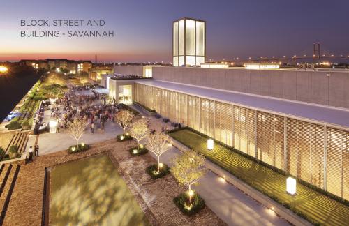
The project is comprised of an 82,000 square foot art and design museum as well as a streetscape redesign and a new public garden located in the west boundary of Savannah, Georgia. The site includes a former railroad administrative building (c. 1865) and ruins of a historic freight warehouse (c. 1853).
The main entrance of the museum lies at the intersection of two city streets, which bisect the building and divide its program into two wings: the east consists of major galleries, art studios and classrooms; the west houses a theater for lectures, screenings and events.
The project’s goal was two fold: to provide space for visiting exhibitions, installations and the permanent art collection; and to reinforce the city’s urban form, establishing a precedent for re-building the public realm in a district recovering from disinvestment.
Savannah’s Western Boundary
Once a center of freight commerce, the district was populated with railroad buildings and freight warehouses – some have been adaptively rehabilitated, others lost. Today, the site is surrounded by open urban land and aging, auto-oriented commercial development from the mid-20th century.
The area is primed for urban expansion. Yet due to its utilitarian past, it lacks the fine-grained urbanism and pedestrian scale of Savannah’s core.
The project thus strove not only to introduce a civic structure into the neighborhood, but also to establish a high quality public realm, setting the precedent for humane urbanism as the district evolves and adapts to the 21st century.
A Synthesis of Architectural Eras
The site was partially surrounded by ruins of an antebellum freight warehouse. The roof had collapsed, several walls reduced to brick piles, and those remaining were in a state of deterioration. Approaching the design process, it was questioned whether the walls were salvageable, or if demolition was the only reasonable and safe option.
But the owners and design team saw an opportunity, drawing on evolutionary precedents such as the Temple of Antoninus and Faustina in the Roman Forum – a 17th century Baroque church constructed within the portico of a 2nd century Roman temple. Both structures survive today as a consubstantial assembly, each relying on the other to form an inseparable whole. As such, the two architectural languages engage in a dialogue of measured, referential contrast. Following this precedent, it was decided to preserve the warehouse ruins through a wholly integrated architectural synthesis.
Dividing the Block, Distinguishing the Skyline
The linear format of the freight warehouse established a block length of over 800 feet, which posed challenges to a walkable urban environment.
To address the challenge, the museum was bisected into two programmatic wings, aligned with a historic street that runs perpendicular to the building’s façade. Bisecting the building with this public connection perceptually divides the block into two 400-foot segments, providing a point of visual punctuation and choice to pedestrians.
The passage through the block at the main lobby is marked by a vertical skyline element – an “urban lantern” that signals the building as a civic landmark, visually reinforcing the block division and creating an orienting element within a district dominated by horizontal structures.
Establishing the Public Realm
The industrial history of surrounding streetscapes did little to accommodate pedestrian traffic. The sidewalk remaining along the fronting street was overgrown and fenced-off from pedestrian use due to dangers posed by deteriorating ruins.
Through collaboration with the city, the project was able to extend into the public street. Sidewalks were widened, detailed with brick recycled from fallen walls. New granite curbing was installed and tree wells were created within the parking lane, allowing constrained sidewalks to feel more generous, and vehicle lanes more compact.
Courtyard space to the building’s south was transformed into a public garden that aligns with and extends Savannah’s public squares, connecting the city center with housing to the west. In its materiality and details, the public garden, like the streetscape, was designed with an eye toward permanence and timelessness.
Response to Charter Principles
Charter Principle 19: A primary task of all urban architecture and landscape design is the physical definition of streets and public spaces as places of shared use.
The overall composition of the museum project reinforces, extends and enhances Savannah’s urban form, and imbues this former industrial edge with new civic character.
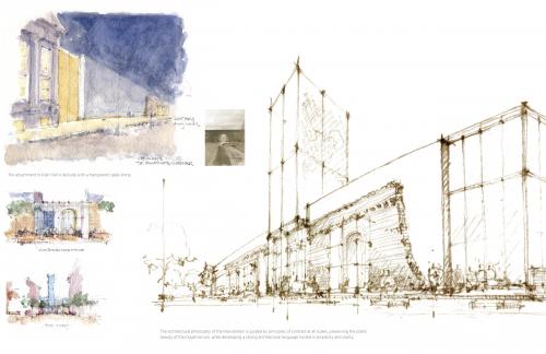
A composite facade merging 19th century ruins with the spare language of the architectural intervention defines and activates the northern street edge. Brick archways along the north ruin wall are reimagined as art display cases. Encased with glass, the exhibitions are brought outdoors, creating a public gallery along the sidewalk.
The lantern rising above the museum entrance is a landmark in the skyline – it orientates pedestrians, defines the character of the street and divides the block into two segments of walkable scale. The south facade gives spatial definition to a new public garden, which is developed in an east-west alignment as a direct extension of Savannah’s historic network of squares.
Charter Principle 20: Individual architectural projects should be seamlessly linked to their surroundings.
This issue transcends style.
The project is situated within Savannah’s west boundary; a district historically dominated by linear, onestory freight warehouses and railroad office buildings. Immediately adjacent to Savannah’s landmark city center, the underutilized district is a logical area for urban expansion.
The museum project represents a simultaneous effort to honor the history of and breathe new civic character into this formerly blighted district. To accomplish these goals, the project reinforces the overall massing and form of the antebellum warehouse buildings and integrates their historic ruins into a new structure. The architectural intervention was done in measured, referential contrast to its historic context; it re-imagines the streetscapes as humane, public spaces; and, perhaps best represented by the glass lantern rising into the skyline, it seeds new character into the city’s west corridor.
Charter Principle 22: In the contemporary metropolis, development must adequately accommodate automobiles. It should do so in ways that respect the pedestrian and the form of public space.
Understanding the need to prioritize the pedestrian experience and maximize public space, the design team conducted a study of available parking in the district, and made a successful case to the city for a complete variance from off-street parking requirements. Concurrently, the team collaborated with the city to optimize on-street parking resources, to add dedicated spaces for bicycles and scooters, and to create a transit stop adjacent to the main lobby.
This strategy led to the creation of an active pedestrian environment along the north sidewalk, now sheltered from travel lanes by on-street parking and integrated street trees. Additionally valuable land resources on the building’s south side have been developed as a public garden instead of a parking lot, which local ordinances would typically require.
Charter Principle 23: Streets and squares should be safe, comfortable and interesting to the pedestrian. Properly configured, they encourage walking and enable neighbors to know each other and protect their communities.
Prior to the project’s development, the frontage street was unsafe for pedestrians. The deteriorated sidewalk was fenced off from the street because collapsing ruins posed great hazard to passers-by. Pedestrians were thus forced to walk within vehicular lanes.
The project design employed the following strategies to create safe, comfortable, welcoming and intriguing streetscapes:
• Dividing the excessively long block into two segments scaled for pedestrian comfort;
• Widening the sidewalk and sheltering it from travel lanes with on-street parking and street trees;
• Transforming the rhythmic arches within the historic ruin wall into display windows, thereby transforming the sidewalk into a public gallery;
• Developing a linear public garden on the south side of the museum that creates a secondary, east-west pedestrian route to the city center and that aligns with and extends Savannah’s network of public squares.
Charter Principle 25: Civic buildings and public gathering places require important sites to reinforce community identity and the culture of democracy. They deserve distinctive form because their role is different from that of other buildings and places that constitute the fabric of the city.
The project advances Savannah’s tradition of architectural landmarks reaching into the skyline, giving overall form and hierarchy to the city and orienting pedestrians toward civic buildings. Carefully proportioned, the lantern marks the main entrance and announces the evolution of this district from its utilitarian past toward a new civic use.
The museum’s distinct expression is rooted in the synthesis of aesthetic eras, creating a dialogue of measured, referential contrast with the ruins. Deriving overall form and massing from linear warehouses indigenous to the district, the museum reinforces visible community traditions and signals a living city.
From the garden entrance’s opening to surrounding streets, to the entrance portico recalling classical forms found throughout Savannah, to the streetscape improvements and pedestrian-engaging jewel-boxes, the project exemplifies time-honored transitions between public and private realms.
Charter Principle 27: Preservation and renewal of historic buildings, districts and landscapes affirm the continuity and evolution of urban society.
The museum’s development within the Central of Georgia Railroad National Historic Landmark District offers a case study in urban continuity and evolution through conservation and renewal. The museum and the accompanying public realm improvements have played a monumental role in the re-emergence of this previously atrophied stretch of the city’s urban fabric – a district that defines the western edge of Savannah’s landmark city center.
Lessons Learned
Museums should not be designed as self-contained, architectural exploits without meaningful relationship to their surroundings. They should contribute and relate to their urban contexts. As civic buildings, museums demand distinct form and expression. They must contribute generously to their urban context, influenced by and enhancing the city’s urban form. Institutions developing civic buildings have a unique opportunity to collaborate with the municipality in order to bring about significant, positive change to the public realm. In order to accomplish this goal, the design of streets and adjoining public spaces must be considered in concert with the design of the building itself.
By preserving and integrating vestiges of historic fabric into the design of new buildings, an urban environment may continually evolve while maintaining a sense of place as well as continuity and connection with the past.
Designers should view the remnants of a site’s history as an asset, rather than a hindrance, to new architectural expressions. As cities grow and historic land uses change, preserving traces of the past in evolving districts will lead to richer, more authentic urban experiences.
A design process guided by the human hand and eye significantly impacts the humanity of the resulting architecture. The museum’s design evolved through a sequence of watercolor vignettes that imagined experiences from the perspective of a pedestrian moving through Savannah’s urban core. The basic design was then developed in 42 hand-drafted plates, refining details of the building’s public facade, the street improvements and the public garden. This deliberative process allowed for a more intuitive consideration of form, proportion and detail, and advanced the design of the building as well as the public realm as a unified whole. While the integration of digital tools later in the design process supported the technical resolution of the structure, the design team worked throughout the design process to maintain the prominent role of the handcrafted and humane.
Transect Zone(s): T4 general.
Status: Complete
Project or Plan's Scale: Region
Land area (in acres): 4
Total built area (in sq. ft.):
Total project cost (in local currency):
Retail area (in sq. ft.):
Office area (in sq. ft.):
Industrial area (in sq. ft.):
Number of hotel units:
Number of residential units (include live/work):
Parks & green space (in acres):
Project team designers: Sottile & Sottile and Lord Aeck Sargent in association with Dawson Architects (Interior designers: Paula Wallace, Glenn Wallace, SCAD Design Group)
Project team developers: Savannah College of Art and Design (SCAD)
Previous site status:
Starting/Ending date of construction/implementation: - 2011


